Dan Q
Hero Member ⚓︎


I have no idea what I am doing
⛺︎ My Room
RSS: 
Guild Memberships:
Artifacts:
 ")
|
 |
« on: Today at @538.28 » |

|
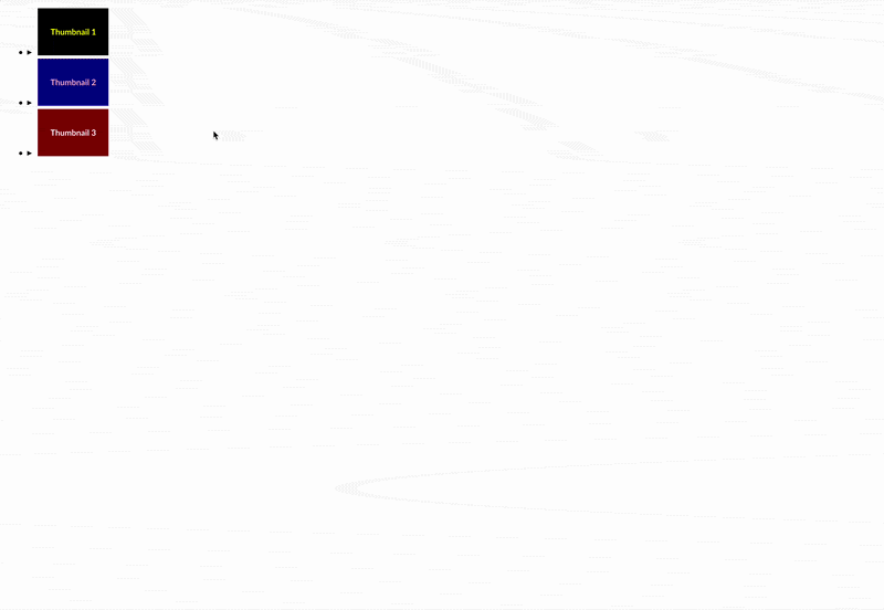
Inspired by a conversation with @FinleyIsHere over in the Wednesday Website Club, here's how I'd personally go about making a:- single page gallery (i.e. not using separate pages for the full versions of images; you can still paginate if you want!)
- with thumbnails that you click to see the full images
- and the full images have descriptions
- with HTML and CSS only (no JavaScript dependency)
Here's what we're trying to make (I've gone for minimal/no "design"; that bit's up to you!):
Rather than just give you a copy-pasteable example (although you can get that from a Codepen at the end!), I've tried to talk you through what I'm thinking and what I'm trying to achieve at each step along the way. My aim isn't to tell you what to do... it's to show how I, personally, approach this kind of problem in a way that you can follow-along with if you like.
Okay, let's go!
Step 1: image preparation
You'll need "thumbnail-sized" versions of your images. While it's technically-possible to use the full-sized version of the file "as" the thumbnail, this will mean that every visitor downloads the full version of every image... which will make the page load slower (boo!). Plus, deliberately making thumbnail-sized ones means that you can, if appropriate, crop them: e.g. the (delightful) Bird and Moon webcomic uses square thumbnails so that all the thumbnails look the same, even though individual comics are a mixture of square, portrait, and landscape. You can also make the thumbnails different, if you want, e.g. by focussing them on a particular part of the image, or by overlaying them with an age rating panda, or something. They're your thumbnails; do what you want!
It's up to you how you resize your thumbnails, but I'd suggest making them all the same height so that they line up nicely in a grid-shaped gallery.
Here's one of my demo images and its thumbnail (they're not very exciting!): 
I'm a huge believer in the value of semantic HTML, so I ask myself: what does the thing I'm making represent, really? To me, an image gallery is a list of images, where each thumbnail is a summary version of the details in the full version. This tells me that I'm probably going to be using a <ul> (unordered list) for my gallery, with <li>s (list items) for each image, and a <details>/<summary> pair to represent the image and its thumbnail.
So here's the HTML I wrote, with my first three images in it:<!--
it's a "list" of image (even though) we don't lay it out like a list;
I'm giving it the class "gallery" so it's easy for me to restyle it
and its contents using CSS later:
-->
<ul class="gallery">
<!-- each image goes in its own list item <li>: -->
<li>
<!--
each item is wrapped in a <details> block which contains:
1. a <summary> version (the thumbnail), and
2. the full version (the image and its description)
-->
<details>
<!-- the "summary" is the thumbnail image -->
<summary>
<img src="thumbnail-1.png">
</summary>
<!--
the full image follows, along with its description;
note use of loading="lazy" so browsers don't download
the image until they need to!
-->
<img loading="lazy" src="full-image-1.png">
<p>Description of first image</p>
</details>
</li>
<!-- I repeat the pattern above for each subsequent image: -->
<li>
<details>
<summary>
<img src="thumbnail-2.png">
</summary>
<img loading="lazy" src="full-image-2.png">
<p>Description of second image</p>
</details>
</li>
<li>
<details>
<summary>
<img src="thumbnail-3.png">
</summary>
<img loading="lazy" src="full-image-3.png">
<p>Description of third image</p>
</details>
</li>
</ul><!-- don't forget to end the list! indent your code to help! -->
The goals with my CSS are:
1. Make the "list" look less like a list and lay my thumbnails out in a "grid-like" pattern.
2. Suppress the <details>/<summary> default little "tick", and make the cursor look "like a link" when hovering a thumbnail.
3. Hide the thumbnail when the full image is shown.
4. Show the full image and its description "full screen" (well, full page), and close it when it's clicked anywhere.
Let's take those one at a time:
3a. Laying out the list like a grid
The CSS for this isn't too complicated, but I'll talk you through it anyway:
- for the thing with class="gallery" (.gallery),
- remove the bullet points (list-style: none;)
- stop indenting it "like a list" (margin: 0; padding: 0;)
- instead, let its list items "flow" alongside each other (display: flex;),
- wrapping when they reach the edge of the page (flex-wrap: wrap;),
- with a small gap between each of them (gap: 15px;) -/* Lay the gallery out like a grid: */
.gallery {
list-style: none;
margin: 0;
padding: 0;
display: flex;
flex-wrap: wrap;
gap: 15px;
}
I'll be doing this extensively. If I wanted to say "all <img>s in my gallery get a 2px red border", I might end up writing something like this:.gallery {
/* ... everything I already wrote, above ... */
img {
/* this is just an example of CSS nesting; not part of the tutorial!!! */
border: 2px solid red;
}
}
3b. Stopping the <details>/<summary> from looking stoopid
This one's a bit arcane because not all browser manufacturers agreed on how it should be done. But here's what I wrote:
- for <summary> items inside galleries (summary, inside . gallery { ... }),
- turn the cursor into a pointer, like it was a link (cursor: pointer;), and
- don't show the "tick" mark (everything else; ugh what nasty code!).gallery {
/* ... everything I already wrote, above ... */
summary {
cursor: pointer;
list-style: none;
&::marker, &::-webkit-details-marker {
display: none;
}
}
}
When the <details> element is "opened" (by clicking on it), it gains the attribute "open". You can think of that as meaning that it has the HTML <details open>: in fact, if you use Inspect Element, that's probably what your browser will say it is! We can use this to target the <details> element when it's open and do things with it.
In this case, I'll:
- find any <img> in the <summary> (i.e. a thumbnail image) inside a <details> that is open (note that I'm using nesting for this: I could absolutely write it out as a long selector, but I know that I'm going to need to do more things in here later!)
- hide it! (display: none;).gallery {
/* ... everything I already wrote, above ... */
details[open] {
summary {
img {
display: none;
}
}
}
}
1. I want to make them fill the screen (on to that in a moment), and
2. There's no way to turn them back to the thumbnail version! (we'll solve that afterwards)
3d. Displaying the full image "larger"
Here's my approach to displaying the full version "large":
- when a <details> is open (details[open]),
- display it in a fixed location, covering everything else on the page (position: fixed; top: 0; left: 0; width: 100%; height: 100%;)
- give it a background color so we can't see the original page contents "behind" it (background: white;)
- display its contents (the full image and its description) in a column, with everything centered (display: flex; flex-direction: column; align-items: center; justify-content: center;)
- and with the full size image (img - while this also targets the thumbnail image, we've already hidden that so it doesn't really matter):
- let it be no wider than the browser window (max-width: 100%;)
- and no taller than 90% of the browser window's Vertical Height (max-height: 90vh;)
.gallery {
  /* ... everything I already wrote, above ... */

  details[open] {
    position: fixed;
    top: 0;
    left: 0;
    width: 100%;
    height: 100%;
    background: white;
    display: flex;
    flex-direction: column;
    align-items: center;
    justify-content: center;

    img {
      max-width: 100%;
      max-height: 90vh;
    }

    /* Here's the stuff I already wrote to hide thumbnails: */
    summary {
      img {
        display: none;
      }
    }
  }
}
3e. Making it "closeable"
I'm really grateful to my past self for setting up such clean nested CSS, because now I'm looking to:
- find the <summary> (the bit that can be clicked to open/close the <details>), inside the open <details>, in the gallery (.gallery { details[open] { summary )- create a new "fake" element after it, using & (which means "the previous thing in the nested list", i.e. the summary) and :after (to create the new fake element) - (I also need to use content: ''; to make the fake element actually appear: it has to have 'content', even if that content is an empty string!) - make that new fake element fill the screen, just like we did with the open details (position: fixed; top: 0; left: 0; width: 100%; height: 100%;) What this does is makes the <summary> - which was otherwise going to be hidden because the only thing "in" it (the thumbnail image) was hidden - fill the page, over the top of the full-page full-size image. Which means that clicking anywhere is is a click on the <summary>, which then toggles the <details> back to closed again: .gallery {
/* ... everything I already wrote, above ... */
details[open] {
/* ... everything I wrote to make full-size images fill the screen ... */
summary {
/* Here's the stuff I already wrote to hide thumbnails: */
img {
display: none;
}
/* Here's the new stuff I'm adding: */
&:after {
content: '';
position: fixed;
top: 0;
left: 0;
width: 100%;
height: 100%;
}
}
}
}
3f. Putting it all together
I've shown you the CSS a bit at a time, but for your convenience, here's a commented copy of the entire CSS:/* Lay the gallery out like a grid: */
.gallery {
list-style: none;
margin: 0;
padding: 0;
display: flex;
flex-wrap: wrap;
gap: 15px;
/* Hide the details/summary 'marker', and use a 'pointer' cursor: */
summary {
list-style: none;
cursor: pointer;
&::marker, &::-webkit-details-marker {
display: none;
}
}
/* When clicking a thumbnail... */
details[open] {
/* display the full image full-screen and centered */
position: fixed;
top: 0;
left: 0;
width: 100%;
height: 100%;
display: flex;
flex-direction: column;
background: white;
align-items: center;
justify-content: center;
img {
max-width: 100%;
max-height: 90vh;
}
summary {
/* hide the thumbnail entirely: */
img {
display: none;
}
/* and add an 'overlay' so clicking anywhere closes the full version: */
&:after {
content: '';
position: fixed;
top: 0;
left: 0;
width: 100%;
height: 100%;
}
}
}
}
Here's how that looks when it's finished:I've put the whole thing into a Codepen so you can try it and make tweaks there, if you want.
I hope that helps somebody! |


 Posts & Arts: 58/1k.beats


 Author


