Home Events! Entrance Everyone Wiki Search Login Register

Welcome, Guest. Please login or register. - Thinking of joining the forum??
November 22, 2024 - @133.87 (what is this?)
Forum activity rating: Three Stars Posts: 33/1k.beats Unread Topics | Unread Replies | My Stuff | Random Topic | Recent Posts    Start New Topic
News: :eyes: ~ Inconvenience is counterculture ~ :eyes:

+  MelonLand Forum
|-+  World Wild Web
| |-+  ✁ ∙ Web Crafting
| | |-+  looking for some general advice on creating graphics for a new site


« previous next »
Pages: [1] Print
Author Topic: looking for some general advice on creating graphics for a new site  (Read 999 times)
Memory
Guest
« on: August 11, 2022 @36.20 »

Hey there! been lurking for a while and just came across a question I wanted to run by you lovely folks!
I'm working on my new site, I've learned very basic html/css and I still have quite a bit to learn, but I was wondering about creating graphics for my site. (the one thing I DO know a lot about;:wink:

Apologies if I don't explain clearly enough!

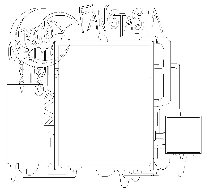
I've started a rough draft- I want the entire site to be make of my own pixel artwork. There will be small animations to it.

I was wondering if I would be better off creating the entire graphic for the background as a single entity, or separate it into pieces and implement them in their spots individually.

I want the bat graphic in the corner to be glinting/moving a tiny bit, and I want the square sign at the bottom right to have an animated neon sign. And the main title will be a flickering neon light.

The space on the far left will be the navigation, and I would like for each option on the list to flicker when hovered on, but no gif animation.

Thoughts on how I should segment the image files specifically? I was thinking about making the entire element one piece, and then building the interactive pieces (the buttons that will interact when hovered and the scroll bar obviously, and any other little things) individually. Would that be a terrible idea? Should I make the navigation sign on the left a separate img file? Since the gems from the bat image will be hanging over it a bit. I suspect this will be an irritating thing to work around but I am really attached to the composition at this point lol.

I hope this makes sense- this will be my first website ever, and I'm trying my best to keep my head above the water! If you have any other tips I would love to hear them. ♥

Logged
ggnonicon
Casual Poster
*


smush the eyelid

⛺︎ My Room
Itch.io: My Games

View Profile WWW

First 1000 Members!Joined 2022!
« Reply #1 on: August 11, 2022 @149.80 »

My own understanding of html/css is self-taught and pretty fragmented, but the way I'd do it would be to have each thing that will move/react be its own image/gif/whatever, and anything that would stay still or at least not react (the frame/tubes, I'm assuming?) can be one thing.
Especially if you're not concerned with making it mobile friendly.
I have a kind-of-maybe similar situation on my old website, and i really banged my head on a wall for two months straight trying to figure it out.

No idea if that helps, but hopefully someone with a more clear understanding passes by.
Logged
Melooon
Hero Member ⚓︎
*****


So many stars!

⛺︎ My Room
SpaceHey: Friend Me!
StatusCafe: melon
iMood: Melonking
Itch.io: My Games

View Profile WWW

Thanks for being rad!a puppy for your travelsAlways My PalFirst 1000 Members!spring 2023!Squirtle!!!!MIDI WarriorMIDI Warrior1234 Posts!OzspeckCool Dude AwardRising Star of the Web AwardMessage BuddyPocket Icelogist!OG! Joined 2021!...
« Reply #2 on: August 11, 2022 @689.12 »

One thing that might be worth thinking about is how tall your design is gonna be; Id suggest avoiding making it so people have to scroll to see the full layout.

With that in mind I would saaayyy; most people use a 1080p resolution and a fullscreen browser (I think; even if you have a 4k screen its prob scaling to 1080 size). That means you have 1080 pixels of vertical screen space, and about 300 of those are taken up by UI elements in the browser and OS. SO that leaves about 780px of vertical space for you; make sure that your pixel layout is not taller than that! (Including padding around it)

Id say try and use as few image segments as possible, the more you have the more complex it'll be to make. Noni is correct; make a big still background image, then add animated stuff on top of it.

One thing that would be super cool would be if you put a split down the middle of your main frame and make it stretch with the browser, then it would expand and oooo that would be cool!

I really like the concept design tooo :ozwomp:
« Last Edit: August 11, 2022 @692.12 by Melooon » Logged


everything lost will be recovered, when you drift into the arms of the undiscovered
Memory
Guest
« Reply #3 on: August 11, 2022 @721.77 »

One thing that might be worth thinking about is how tall your design is gonna be; Id suggest avoiding making it so people have to scroll to see the full layout.

I think I've got all of the dimensions down- been looking at other sites with a similar vibe and noting down the sizes of things. I'm not interested in having it be mobile friendly, at least for now, so I'm just focused on making sure the size of everything will be on point. I made a little "map" of sorts with the sizes of everything- luckily working with pixel art it's pretty easy to stay on target.

Thank you for the advice! I think I've settled on making the main "frame", a separate background, the bat emblem, the title, and the neon sign elements all separate files. I gotta make the buttons separately- I've got big ambitions for these buttons.

I like your idea of having the main body stretch, however I think I want to make it a little contained section. I'm really attached to sites that have just a little body of text near the center and a little scroll bar. I love sites that are cute and compact- I want it to be like a little bulletin board on the outside of a building.

I think I'm gonna just go for it and get the art done first- I can mockup a fake version of the site in photoshop with the pieces and get an idea of where I want everything to be before I start the daunting task of making it happen for real lol! Hopefully next time I come back it will be to show off my site and not be floundering terribly instead. xD
Logged
Pages: [1] Print 
« previous next »
 

Vaguely similar topics! (3)

Best way to have a 2 column site?

Started by ObspogonBoard ☔︎ ∙ I need Help!

Replies: 3
Views: 2428
Last post February 13, 2023 @208.53
by fLaMEd
How do you prefer to keep your site organized (or not)

Started by NightdriftBoard ✁ ∙ Web Crafting

Replies: 30
Views: 8821
Last post August 02, 2024 @153.99
by candycanearter07
GUIDE: How to fix links on a frame site! - MK Frame-Link System

Started by MelooonBoard ✁ ∙ Web Crafting

Replies: 9
Views: 10321
Last post March 10, 2024 @777.40
by Salty

Melonking.Net © Always and ever was! SMF 2.0.19 | SMF © 2021, Simple Machines | Terms and Policies Forum Guide | Rules | RSS | WAP | Mobile


MelonLand Badges and Other Melon Sites!

MelonLand Project! Visit the MelonLand Forum! Support the Forum
Visit Melonking.Net! Visit the Gif Gallery! Pixel Sea TamaNOTchi